Ever noticed how so many things in life seem to cluster around an average? Exam scores, human height, even measurement errors—they all seem to cuddle up into a pleasing, symmetrical hump. That’s the normal distribution, or what most of us lovingly call the bell curve. It’s not just a statistical quirk; it’s the poster child of probability.
But why? Why does nature seem to have a thing for this curve? Let’s take a walk through the math meadow, with a few pit stops at dice tables, psych labs, and even stock markets.
Understanding the Shape of Normal
The bell curve has a few magical properties:
- Symmetrical around the mean
- Predictable proportions: ~68% within ±1σ, ~95% within ±2σ, ~99.7% within ±3σ
- Smooth, continuous, and surprisingly calming to look at (seriously, it has a vibe)
Let’s Roll Some Dice and Watch Normal Take Shape
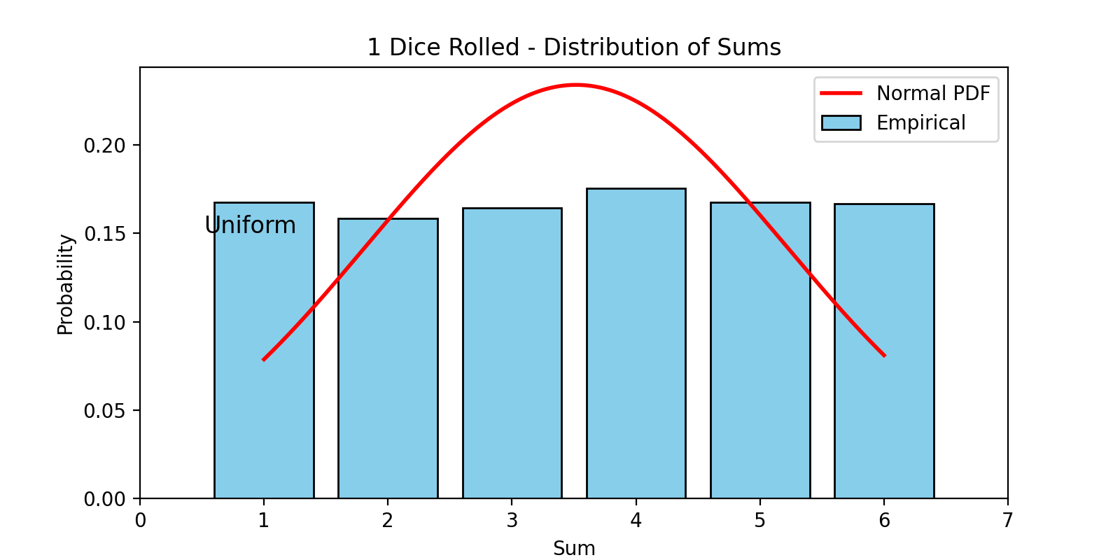
Imagine rolling one die. The outcome? Uniform. Every number is equally likely.
Now roll two dice and sum the result. You’ll start to see clustering around 7. Roll three, four, five dice—plot the sums—and voila, you’ll watch a bell shape unfold before your eyes. That’s the Central Limit Theorem (CLT) doing its magic.
The CLT states that when you sum a large number of independent, identically distributed variables (with finite mean and variance), the result approaches a normal distribution.
Where the Normal Curve Quietly Shows Up
The normal distribution isn’t just theoretical candy. It runs the real world:
Biology & Medicine: Measurement errors and physiological traits (like height or blood pressure) often follow this curve.t you need.
Psychology & Education: IQ scores are modeled as normally distributed. Standardized tests like the SAT are norm-referenced.
Manufacturing: Defects and tolerances are tracked using bell curves to flag when things go wrong.
Finance: Portfolio returns are often assumed to be normal (even if they aren’t—looking at you, Black Monday).
But Wait—Is Everything Normal?
Not everything fits the bell curve—and that’s important to know.
While many things in life do form a normal distribution, others don’t. Sometimes the data is lopsided (we call that skewed). Sometimes it has a few dramatic outliers (heavy tails). Or sometimes, it has more than one peak (like a camel with two humps!).
Here are some examples:
- Wealth distribution: A few people own a lot, most people own a little. That’s not normal—it’s more like the 80/20 rule.
- Earthquakes: Big ones are rare but not as rare as the bell curve would expect. They follow different patterns entirely.
- Internet traffic: It doesn’t cluster around a single average. Instead, it has multiple common values and can be all over the place.
The takeaway? While the normal curve is helpful, it’s not always the best fit. Always check your data’s shape before assuming it’s bell-shaped.
Use the curve, but don’t let it curve your thinking.
Why We Still Love It
Despite its flaws, the normal distribution remains a statistical sweetheart:
- It’s simple yet powerful
- It’s widely applicable
- It has clean math and tons of handy properties
- It lets us use the elegant tools of Z-scores, confidence intervals, and hypothesis tests
Plus, it gives us an intuitive grip on uncertainty—something the human brain craves.
Beyond the Curve: A Final Reflection
The bell curve is more than a mathematical darling—it’s a mirror reflecting order in chaos. But like any mirror, it only shows what it’s designed to show. Respect its elegance, admire its usefulness, but stay curious about the world beyond its curve. Because often, what’s interesting lies in the outliers.
Want More?
Subscribe for quirky, brainy posts about stats, psychology, and all things mind.
Download our free PDF: “20 Neuroscience Facts That’ll Blow Your Mind (and Possibly Your Distribution)”
Got a bell-shaped story? Drop it in the comments or tag me on Instagram.
Loved the curve? Wait till you meet the drama behind it. Step into the chaotic world of spread metrics: Variance vs. Standard Deviation →
1 thought on “You’ve Been Living in a Bell Curve—and Here’s the Proof”